Fitting Data
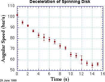
A common and powerful way to compare data to a theory is to search for a theoretical curve that matches the data as closely as possible. You may suspect, for example, that friction causes a uniform deceleration of a spinning disk, so you have gathered data for the angular velocity of the disk as a function of time. If your hypothesis is correct, then these data should lie approximately on a straight line when angular velocity is plotted as a function of time. They won't be exactly on the line because your experimental observations are inevitably uncertain to some degree. They might look like the data shown in the figure at right.
Our task is to find the best line that goes through these data. When we have found it, we would like answers to the following questions:
- What is the best estimate of the deceleration caused by friction? That is, what is the slope of the line.
- What is the uncertainty in the value of deceleration?
- What is the likelihood that these data are in fact consistent with our hypothesis? That is, how probable is it that the disk is uniformly accelerated?
What do you mean, “best line”?
Associated with each data point is an error bar, which is the graphical representation of the uncertainty of the measured value. We assume that the errors are normally distributed, which means that they are described by the bell-shaped curve or Gaussian shown in the discussion of standard deviation. The height between the data point and the top or bottom of the error bar is \( \sigma \), so about 2/3 of the time, the line or curve should pass within one error bar of the data point.
Sometimes the uncertainty of each data point is the same, but it is just as likely (if not more likely!) that the uncertainty varies from datum to datum. In that case the line should pay more attention to the points that have smaller uncertainty. That is, it should try to get close to those “more certain” points. When it can't, we should grow worried that the data and the line (or curve) fundamentally don't agree.
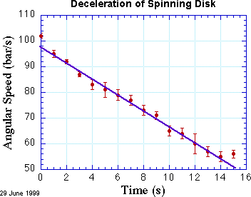
A pretty good way to fit straight lines to plotted data is to fiddle with a ruler, doing your best to get the line to pass close to as many data points as possible, taking care to count more heavily the points with smaller uncertainty. This method is quick and intuitive, and is worth practicing. Here’s my attempt to fit a line by eye.
Least-Squares Fitting
For more careful work, we need a way to evaluate how successfully a given line (or curve) agrees with the data. Each data point sets its own standard of agreement: its uncertainty. We can quantify the disagreement between a point and the line by measuring the (vertical) distance between the point and the line, in units of the error bar for each point. The data point at \( t = 10\text{ s} \), for example, is about 1 error bar unit away from the line. It turns out that a very useful way of adding up all the discrepancies, \[ \frac{y_i - f(x_i)}{\delta y_i} \] between the line and the data is to square them first. That way, all the terms in the sum are positive (after all, a point can't be correct with 200% probability!).
We define the function \( \chi^2 \) to be this sum of squares of discrepancies, each measured in units of error bars. Symbolically, \[ \chi^2 \equiv \sum_{i=1}^N \left(\frac{y_i - f(x_i)}{\delta y_i}\right)^2 \] where the sum is over the \( N \) data points and \( f(x) \) is the equation of the line (or curve) we think models the data. Since it is the sum of squares, \( \chi^2 \) cannot be negative. We would like \( \chi^2 \) to be as small as possible. As we try different lines, we can calculate \( \chi^2 \) for each one. The “best line” is the one with the smallest value of \( \chi^2 \). That is, the best line is the one which has the “least squares.”
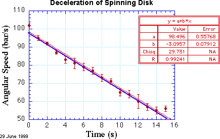
Igor Pro can perform the operation of finding the line or curve that minimizes \( \chi^2 \). The result of performing this least-squares fit is shown in the red curve in the figure.
Evidently, my \( \chi \) by eye method was pretty good for the slope, but was off a bit in the offset. According to this fit, the acceleration is \( -3.10 \pm 0.08 \text{ bar/s/s} \), which you can read off the fit results table. This is pretty neat! The plotting and analysis program found the best-fit line for me, and even estimated the confidence of the slope. What could be better?
Well, what about some assessment of the likelihood that these data are really trying to follow a straight line? We may have found the best line, in the sense of the one that minimizes the squared deviations of the data points, but it may well be that the data follow a different curve and so no line properly describes the data.
The Meaning of \( \chi^2 \)
The value of \( \chi^2 \) tells us a great deal about whether we should trust this whole fitting operation. If our assumptions about normal errors and the straight line are correct, then the typical deviation between a data point and the line should be a little less than \(1 \sigma \). This means that the value of \( \chi^2 \) should be about equal to the number of data points.
Actually, we have to reduce the number of data points \( N \) by the number of fit parameters \( m \) because each fit parameter allows us to match one more data point exactly. In the pictured data set, there are 16 data points and 2 fit parameters. We can compute the reduced value of \( \chi^2 \), denoted \( \tilde{\chi}^2 \), by dividing \( \chi^2 \) by \( N - m \). Hence, we find here that \( \tilde{\chi}^2 = 2.1 \). This value strongly suggests that the data and the line do not agree!
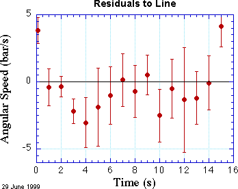
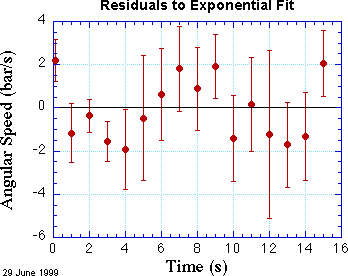
How can this be? They look so good together! A good way to look more closely is to prepare a plot of residuals. Residuals are the differences between each data point and the line or curve at the corresponding value of x. Such a plot is shown at the right.
For a reasonable fit, about two-thirds of the points should be within one error bar from the black line at zero. In this fit we can see that several points are considerably more than one standard deviation from the line at zero. The first point is decidedly above the line, and the last point is clearly above the line, too. Almost all the other points are below the line, and a few of them are considerably below, again measured in units of their error bars. Maybe we need a curve that opens up a bit, instead of a line.
On more solid theoretical grounds, if the braking torque (twisting force) is proportional to the rotational speed, then we would expect a speed that decreases exponentially with time. Let’s try an exponential curve of the form \[ \omega = \omega_0 \exp(-t/\tau) \] where \( \omega \) is the angular velocity and \( \tau \) is the characteristic time of the deceleration. The result of performing such a fit is shown below.

Does it look a bit better to the eye? Maybe. But it certainly looks better statistically. The value of \( \chi^2 \) = 16.3, which means \( \tilde{\chi}^2 = 1.16 \). It is a little higher than expected, but not alarmingly so. According to the table in Appendix D of An Introduction to Error Analysis, Second Edition, by John R. Taylor, the probability of getting a value of \( \tilde{\chi}^2 \) that is larger than 1.16 on repeating this experiment is about 31%. That is, slightly more than 2/3 of the time we should expect a value of \( \tilde{\chi}^2 \) that is smaller than this value. Not perfect, but quite reasonable.
By contrast, the same table gives the probability that the straight line fit shown above is correct is only about 1%. It's hard to see by eye that the exponential fit is so much better than the linear fit.
A residual plot also shows a more even distribution of errors. Now about half the points are above the zero line, half below. The end points are still above the line, but not markedly so. The residual plot helps build confidence in our exponential analysis.
Fit results
Now that we have a fit with a reasonable value for \( \chi^2 \), we can be more confident of the values determined by the fit. These values, and their uncertainties, are shown in the red table of the figure. (I hasten to add that such a means of presenting this information is informal; it is great for lab notebooks and notes, but in a formal presentation of data, such as in a technical report or journal article, such information is removed from the figure and the most important parts are placed in a caption below the figure.) In particular, the deceleration time constant is \( \tau = (24.3 \pm 0.7) \text{ s} \) and the initial angular velocity is \( \omega_0 = (100.2 \pm 0.6)\text{ bar/s} \).
Conclusions
Based on the better behavior of the exponential fit we can conclude that
- The data are inconsistent with a model of uniform
deceleration, but are probably consistent with a frictional
torque that is proportional to the angular velocity.
- The time constant for the exponential decay is \( (24.3 \pm 0.7)\text{ s} \)
- The initial angular velocity is \( (100.2 \pm 0.6\text{ bar/s} \).
Pitfalls to avoid
- It might seem that the best value of \( \chi^2 \) would be zero. After all,
that means that your curve passes exactly through each and every data
point. What could be better than that?
Well, each data point is supposed to have some uncertainty, estimated as \( \delta y_i \). It is fantastically improbable that the discrepancy between each point and the curve should vanish. When \( \chi^2 = 0 \), it means that you dry-labbed the experiment. Don’t even think of trying it!
- What would it mean if \( \tilde{\chi}^2 \ll 1 \)? See if you can figure it out, before clicking here.
- What would it mean if \( \tilde{\chi}^2 \gg 1 \)? Think of at least two possible explanations before clicking here.
Subtleties
Thus far we have assumed that the errors in the dependent variable (along the y axis) are normally distributed and random, but that the value of the independent variable is perfect. Quite commonly, the uncertainty in the x value is significant and contributes to the overall uncertainty of the data point. Is there a way to account for this additional uncertainty?
Errors on both axes
Conceptually it is not too much more difficult to account for uncertainties in both the x and y values. If the x uncertainties dominate, the simplest approach is simply to reverse the roles of the dependent and independent variables. This requires you to invert the functional relationship between x and y, however.
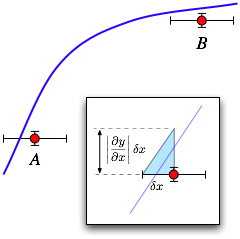
If inverting the function is impossible, or if both x and y uncertainties are significant, you will need to map the x error into an equivalent y error. As shown in the figure, the significance of an x uncertainty depends on the slope of the curve. At point A, where the curve is steep, the x uncertainty is sufficient to make the point agree with the curve. At point B where it is shallow, the same size x error does not produce agreement.
As shown in the inset with the blue triangle, to map the error in x into an equivalent error in y, you can use the straight-line approximation of the derivative of the fit function at the x value of the data point to compute an effective y error according to \[ \delta y_{\rm eff} = \left|\frac{\partial y}{\partial x}\right| \delta x \]
However, there is a problem. You don't know the right curve to use to compute the derivative! Sometimes this is a real problem, but frequently you have a pretty good idea based on the data in the neighborhood what the slope of the right curve must be. If that is the case, multiply \( \delta x_i \) by the slope to produce an effective \( y \) uncertainty, \( \delta y_{i\text{ eff}} \).
If the y uncertainty in the measurement is also appreciable, you can combine \( \delta y \) and \( \delta y_{\rm eff} \) in quadrature to produce an honest estimate of the actual uncertainty of the data point.