Introduction to Igor Pro
Overview
Igor is a very powerful data acquisition and analysis program that grew up on the Macintosh but has been available for both Macintosh and Windows for a number of years. The Windows version runs on Linux under VirtualBox. Early versions of Igor had a steep learning curve, but by version 4 the program had become significantly more intuitive and manageable for beginners. At the same time it has grown in power and sophistication, with significant image-handling capabilities, as well as the ability to develop graphical user interfaces for data acquisition or analysis programs.
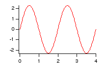
To learn how to make a graph such as the one shown above, follow the discussion below the graph. Click on a feature of the graph, or the text links beneath it, to jump to the instructions for that feature.
A little history is useful for understanding how Igor thinks about data. A spreadsheet thinks about data as a two-dimensional array, Matlab thinks everything is a matrix, and Igor thinks of data as waves. Originally, a wave was a one-dimensional array of data points with an implied point scaling, such as might be obtained from an analog-to-digital converter (ADC) that samples a voltage at a fixed time interval. If the ADC was set to sample one point each millisecond, then the points in the wave would have a time scaling of 1 ms. Suppose we have a wave w holding such data. The command
SetScale/P x 0,0.001,"s",w
sets the appropriate time scale for the wave. Why is this useful? Well, if you plot such a wave, the x axis will automatically know the units, and will label them appropriately. It will also automatically use SI prefixes to keep the values readable. Furthermore, you can access individual points of the wave either by point number (index) or by time value directly. For example,
print w[10], w(0.01)
prints the value of the 11th point of the wave twice (Igor counts from 0, not 1). Asking for w(0.0105), which corresponds to a position between two points of the wave, causes Igor to interpolate automatically. Pretty handy! Even better, when you take a Fourier transform of w, Igor automatically updates the wave's time scale to a frequency scale, so that if you plot the transformed data it comes out in Hz.
Meanwhile, Igor has been generalized to handle two-, three-, and four-dimensional waves, and its scripting facility has been generalized to handle both interpreted scripts (slower) and compiled functions (very fast). In the following I will give but the most cursory introduction to Igor. See the Help menu for a variety of ways to learn more about how to put Igor's power to work.
GUI or Command Line?
You can do everything you need to in Igor using the menus and other graphical user interface elements, never typing a command into the command line. For many operations, Igor takes the settings you specify in a dialog box and produces a text command, which it enters in the command line for you and then executes. You can ignore the commands, or you can use this behavior to learn how to script Igor. You can also copy previously run commands from the history window into the command line by selecting them and pressing Enter twice, one to copy and one to execute the command.
Entering Data
You may type data directly into a data sheet or import data from the clipboard, from a text file, or from binary files.
Keyboard Entry
To produce a data window into which you can type or paste values, use the New | Table... command or type the command edit into the command line.
Type your data in columns noting the following points:- Return advances the cursor down the column
- Tab advances the cursor to the right
- Shift tab move one cell to the left
- Enter advances the cursor to the next cell
- Double click on the column name to edit the display settings for the column.
- Right click (or command-click or control-click) on the column name to rename the wave associated with the column.
Note that an Igor data window differs from a spreadsheet in a very important respect. In a spreadsheet the cells exist whether they have any data in them or not. You can put a number in the fourth row without having anything in the first three rows of a column. In Igor, each column corresponds to a one-dimensional wave (although it is also possible to display and edit 2-, 3-, and 4-dimensional waves in tables), and each wave has a well-defined length. The gray cell at the bottom of a column indicates the end of the wave. Typing in that cell adds a new point to the end of the wave.
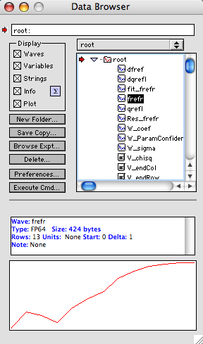
There is another subtle but very important difference between Igor and spreadsheets, Kaleidagraph, and Origin. Igor waves (data) are separate from their visual representation. If you close a data window, you remove the tabular representation of the wave(s) shown in the window. The wave(s) still exist within Igor. You can locate and visualize them very conveniently with the Data Browser, which can be activated with the Data | Data Browser command.
Using the Data Browser you can find out information about each wave, as well as see a quick graphical representation of its data. If you double click on the name of the wave, Igor opens a data window allowing you to inspect or edit the wave's values. If you double click on the little graph of the wave, Igor makes a full-fledged graph window of the wave.
Import from the Clipboard
If the data exist in some other program, copy to the clipboard, switch to Igor, open a data window (either Window | New Table... or enter edit in the command line) and paste. If the data on the clipboard are not tab-delimited, this method does not work. Assuming that the data are saved in a text file, use the Data | Load Waves... command. You can also load data from an Excel spreadsheet with this method.
Text Import from a File
Use the Data | Load Waves... command to load the data from a text file. You will probably want to use the General Text format, but if that doesn't work try a different type.
Data Import from an Excel File
Use the Data | Load Waves | Load Excel File... command. You need to know the Excel cell range of the data you wish to load (e.g., A1..D24).
Calculations
Igor makes it very simple to compute with waves. Suppose you have a wave named w and you would like to replace its values with the sine of its values. Type the command
w = sin(w)
In the command line and press Enter. Each value in the wave is replaced by its sine. If you don't want to lose the original data, but want to have a “copy” with the sine values, you must first duplicate w. You can use command Data | Duplicate Wave... or type the command
Duplicate w, copyOfW
copyOfW = sin(w)
where copyOfW is the name of the copy you'd like. If you want to see copyOfW in a data table that already has w, bring that table to the front and use the command Table | Append Columns to Table... or issue the command
Append copyOfW
To obtain statistics (mean, standard deviation, etc.) on the data in wave w, you can issue the command Analysis | Wavestats... or type
Wavestats w
Plotting Data
Once you have entered or loaded waves for plotting, you can create a graph using the Windows | New Graph... command. Because each one-dimensional wave has an x scaling automatically, you can plot the data against this scale, or you can plot one wave against another in a standard xy plot. Select the y wave (and the x wave, if desired) and click the Do It button. You can add more than one wave to the plot before leaving this dialog, or you can go to the Graph menu and Append Traces to Graph.... The resulting plot is shown at the right. If you are eager to learn the command line approach, this plot was made with the command
display frefr vs qrefl
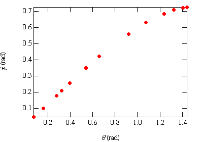
By default, Igor plots the data by connecting the discrete points with straight line segments. Using the Graph | Modify Trace Appearance... command you can change from lines to symbols, and you can adjust the plot symbol and its size in the dialog box.
To produce mirrored axes, double click on an axis to bring up a (complicated) dialog that allows you to modify lots of things about the graph. Check the Live Update checkbox to see the effect of the changes as you make them. In the Axis tab, uncheck the Standoff box and set Mirror to On. Then click the Axis Label tab and enter the appropriate text. Igor uses a bizarre set of “escape codes” to encode font changes, scripts, data symbols, and other fancy stuff. You can access all of this power using the pop-up menus in the Insert region of the dialog.
Then click the Axis Range tab and select Round to nice values, if you wish. Before leaving the dialog, use the Axis pop-up to select the opposite axis and make adjustments to it, too. For the curious, the text commands to produce the modified graph are:
ModifyGraph mode=3,marker=19,tick=2,mirror=1,standoff=0
modifygraph gfsize=14,gfont="times"
label bottom "\f02\F'Symbol'q\]0 (rad)"
label left "\f02\F'Symbol'f\]0 (rad)"
Error Bars
To add error bars from values in a wave to a data series in a plot, right-click (or command-click or control-click) a point in the series and select Modify xxx (you can also select Graph | Modify Trace Appearance...). Check the box for Error bars... and work through the dialog. Note that there is no correlation between placing error bars on a graph and using uncertainties in a fitting procedure.
Annotating the Graph
Igor does not automatically label the axes of a plot, although it does use the units that have been defined for both the x and y data. To label axes, either double click on an axis to bring up a dialog, or use the command
label bottom "Frequency"
label left "Amplitude"
You can also add annotations to the body of graph with the Graph | Add Annotation... command (or right-click, command-click, or control-click within the plot area of the graph to bring up a contextual menu. One of the predefined annotation styles is a Legend, which inserts symbols and wave names for each of the waves in the graph. You can then edit the text of the legend to make it say whatever you like.
Annotations in Igor are placed with respect to an anchor point on the graph, which is specified by a two-letter code. As usual, you can either set this using the dialog or from the command line. The horizontal codes are L(eft), M(iddle), R(ight), and the vertical codes are T(op), C(enter), B(ottom). Hence, to place a legend anchored to the top right corner using the command line, you would type
legend /A=RT
Plotting Functions
To plot a function in Igor, you must create a wave to hold computed values of the function. You can use the menus or the command line. For a change, I'll describe the command form first. Let's say we want to plot the curve y = 2.3 sin( π x) in the range from 0 to 4. Here's the code:
Make /N=200 wSin
SetScale /I x 0,4,"",wSin
wSin=2.3*sin(pi*x)
Display wSin
- The first line creates a wave called wSin. The /N switch sets the number of points in the wave. If you omit this switch, you get the default number, which is 128. Other switches allow you to specify single or double precision, or integer format of various length, or text.
- The second line sets the x scaling of the wave to cover the range from 0 to 4. The /I switch means that the x value of the final point is 4; omitting that switch causes the final point to be one step shy of the right limit. The string argument holds the units of the x axis for this wave, which is empty in this case.
- The third line computes values for the wave. Notice that x refers to the x value of each data point. If you want to refer to the index number of each point, use p instead of x. Note that Igor numbers points from zero.
- The fourth line creates a plot using the default settings.
All statements can be managed from the menus. For the first line, use Data | Make Waves.... For the second use Data | Change Wave Scaling.... For the third, use Analysis | Compose Expression.... And for the fourth, use Window | New Graph....
Fitting Data
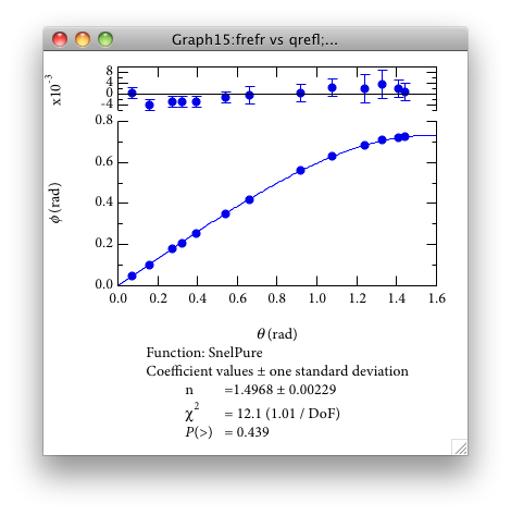
The basic ideas of data fitting are discussed on the fitting page. Igor excels at data fitting operations, which begin with the Analysis | Curve Fitting... command. Although not strictly necessary, it is quite helpful to prepare a plot of the data before starting the fitting operation. Bring this plot to the front and then issue the Curve Fitting... command. When the dialog comes up, make sure the From Target box is checked. This limits the list of waves that appear to those already present in the topmost graph window.
Select the wave you want to fit along the y axis, then select its companion x wave or _calculated_ if the wave is plotted against its built-in x scaling. Select a function from the list of pre-defined functions, or define your own. The data I'll fit are \( \phi(\theta) \) describing the angle of refraction as a function of the angle of incidence. The fit function is therefore \[ \phi = \arcsin\left( \frac{\sin\theta}{n} \right) \]
To enter such a function into Igor, click the New Fit Function... button and enter n in the list of parameters. Enter theta as the independent variable, then tab to the function definition box. Enter
f(theta) = asin( sin( theta ) / n )
for the fit function definition. Note that there is no degree mode in Igor; trigonometric functions are always in radians, so if you need to convert to degrees, multiply by \( 180/\pi \).
Click the Data Options tab and use the pop-up menu to select a wave holding the \( y \) uncertainties (that is, uncertainties in \( \phi \). If you wished to select only a portion of the data, there are options on this tab to allow you to do this, too. Click the Coefficients tab and enter an initial guess for n. Then click the Graph Now button and make sure that the computed curve passes through the data, at least roughly. If not, adjust the value of n.
One of the options in the fitting dialogs is to add a textbox holding information about the fit parameters to the graph. This is what that tab of the fitting dialog looks like:
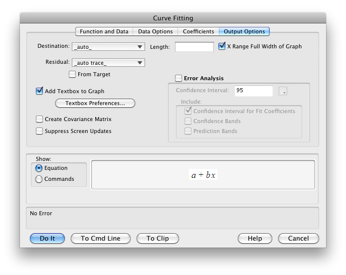
If you would like the fitting curve to extend to the limits of the x axis, click the X Range Full Width of Graph box. If you would like residuals to be computed and displayed automatically, select _auto trace_. To add fitting information to the plot, check Add Textbox to Graph. You can customize the textbox that shows information about the fitting results by clicking on the Textbox Preferences... button. Then click the Do It button. The result is shown in the figure.
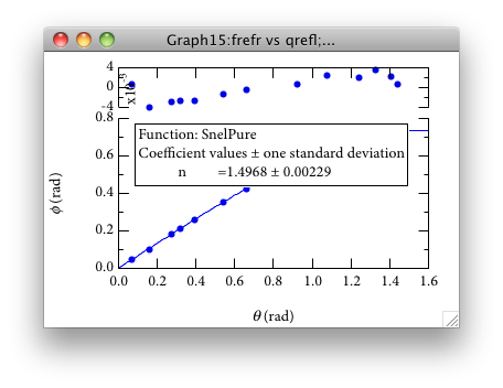
Besides the lack of fitting information on the graph (which is useful to have on the graph that will go into a lab notebook), there are another couple of problems. The default placement of the label for the residual axis is poor, and we should add error bars to the residuals. Here's how to tidy up:
- You can move the label for the residuals simply by dragging it, or you can use the Label Options tab of the Modify Axis dialog by double clicking on the axis. Set the value of Axis label position to something like 55.
- Set the axis scaling to Round to nice values in the Modify Axis dialog.
- Add error bars to the residuals by right-clicking (or command-clicking or control-clicking) on a residual data point and selecting Modify xxx... and checking the Error Bars box.
- Add a zero line to the residual axis using the Ticks & Grids tab of the Modify Axis dialog.
- Add the fitting information using the Graph | Add Annotation... command and typing in the information you like (or copy it from the history area first, and paste it into the annotation text box).
For including a graph in a technical report or publication, you should copy down the information from the fit, remove it from the graph, and place it in the figure caption.
Fitting to a subset of the data
Sometimes, you may wish to exclude one or more data points from a fit. While it is possible to duplicate the waves holding the plot data, delete the offending point(s), and then fit again, there is a better way. It consists in creating a “mask” wave having exactly the same number of data points as the y data of the plot and filling this wave with either 1 or 0. A 1 means to use the point in the fit; a 0 means to leave it out. Here's some step-by-step instructions.
Let’s suppose that you are plotting yw vs xw, but you want to exclude all data points for which the value of xw is greater than 1.2.
- Duplicate xw, calling the copy “mask”. You may use the Data menu or type the command Duplicate xw mask . Duplicating the x wave ensures that the mask wave has the same number of points, which is critical.
- Set the values of mask according to the desired
criteria. In this case, we will set them to 1 if the x value
is less than or equal to 1.2, and 0 otherwise. In the command line,
enter the command
mask = (xw <= 1.2 ? 1 : 0) The ternary operator, ? :, is a compact if-then-else operation. The value before the question mark is a boolean expression. If it is nonzero (i.e., true), then the value of the ternary operator is the value given after the question mark. If it is zero (false), then the value after the colon is returned. - If you'd like to check out the values in mask, and you already have a data table that shows the values of xw and yw, bring that table to the front and append mask to it: AppendToTable mask
- Now bring the graph holding the data you wish to fit to the front and initiate the fitting procedure (Analysis | Curve Fitting...). On the second tab (Data Options), you have the option to select a mask wave. Set this to the wave of ones and zeros you have created, and only the points corresponding to ones will be used in the fit.
- If you have asked for residuals to be displayed, the residuals corresponding to points with mask == 0 will be bogus. Using the ternary operator, it is easy to hide them once the fit is finished. Assuming that the y wave is called yw and that you have asked for an auto trace of the residuals, the residual wave will be called Res_yw. In that case, issue the command Res_yw = mask == 1 ? Res_yw : NaN. This sets the meaningless residuals to NaN, which stands for “not a number” and causes them to disappear from the plot.
Printing Graphs
For use in a lab notebook, it is very convenient to print a version of your graph that is small enough to permit you to annotate the graph and explain its significance on the same notebook page. A graph with a plot area of about 4 inches by 3 inches is quite good for this. In Igor Pro tab of the print dialog you can specify the size you wish for the printed graph.
Using the Window | New Layout... command you can print multiple graphs, or multiple copies of the same graph, on a single page.
Exporting Information
You may export data and graphics from Igor by copying to the clipboard or by saving to a file. Export data using Data | Save Waves... command, and choosing the format for the exported data.
There are a few tricks for exporting graphs successfully, depending on the destination for the graph.
Copying a Graph to a Word Processor
Be sure the graph you wish to copy is the frontmost window, then issue the Edit | Export Graphics... command. You may select the plot size either by choosing the same as the plot window or by typing dimensions directly into the dialog. Then select a format for the graphics information to be put on the clipboard. Note that the PNG (portable network graphics) format is a (color) bitmap format. Such formats don't scale well for printing at high resolution or viewing at high magnification, although you can alleviate this problem somewhat by having the graph made at 2X or 4X resolution. (In any case, do not use JPEG format, which handles the crisp lines of a graph very poorly, since it is designed for photographs.) The image is placed on the clipboard for pasting into another application.
If the destination for the graph is a PostScript printer, use a PDF picture. If the destination is a bitmap (inkjet) printer, a PDF picture works fine on Macintosh. On Windows, use an Enhanced Metafile.
Using LaTeX
How to include a figure in LaTeX depends on the version of LaTeX that you are using. Most people these days use pdflatex which produces a PDF file directly, rather than the original latex command, which produces a DVI (device-independent) file. pdflatex accepts graphics files in PDF, PNG, or JPG formats. Of these, only PDF is a vector-graphics format, which means that it will scale and print properly regardless of resizing and resolution. If you compile with latex to a DVI file, you will need to produce an encapsulated PostScript (EPS) file.
Igor can output PDF and EPS graphics files directly. To save a graph in either EPS format, start with the File | Save Graphics... command. Select the format you want and fill out sizing options. On Macintosh, you should pick Quartz PDF if you want a PDF file.
Once the graphic file has been saved in the same directory as your source .tex file, you can include the graphic with the following LaTeX commands:
- Add the command usepackage{graphicx} at the top of your document, or simply add the graphicx package to the list of packages.
- Add a line such as the following, to include the file (which should be in the same directory as the source .tex file). includegraphics[keepaspectratio=true,width=4in]{MyFig}. The optional arguments in brackets are handy for rescaling the graphic to a desired width. Note that I have omitted the file suffix from the graphic.
- If your TeX program cannot find the graphic without the suffix, try adding the following lines near the top of your source file.
\DeclareGraphicsExtensions{.pdf,.png,.jpg} // or
\DeclareGraphicsExtensions{.eps}
If you would like to keep your graphics files in a different directory than the source file(s), you can declare one or more graphics directories with a statement such as the following:
\graphicspath{ {./figs/} {./eps/}}
Posting a Graph on the Web
A bitmap graphics format is preferable for posting on the web. The line art of data plots is better suited to a lossless compression format, such as PNG, than to a lossy form, such as JPEG. Both are possible in Igor, as discussed above. Start with the File | Save Graphics... command.
<img src="mygraph.png" alt="My Graph" width="500" height="375">Troubleshooting
When I paste data into a datasheet, it all comes out smashed in one column. Usually this means that spaces are present between columns in the data. Web browsers may substitute spaces for tabs when they display tabular information, so even if the original file had tabs, the copy on the clipboard may not. You can overcome this problem by first saving the text to a file. Fitting doesn't work. I can't see a curve and I just hear a beep. There are several possibilities.
- Check that you have entered the function correctly.
- Make sure that you have given sensible initial values to each fit parameter. Fitting is a tricky business, and unless you give a good set of initial guesses for the parameters, the program will more than likely run away from the right answer and end with an annoying Singular Matrix Error.
Last updated: 2015 January 29